CSS general concepts
What is CSS really?
Just like HTML, CSS is not a programming language (although there are many controversies and discussions on this topic) and it is not a markup language either, it is a stylesheet language.
CSS is a styling (design) language that allows web pages to be customized. This means it enables selective application of styles to elements in HTML documents.
CSS is the language of style rules we use to apply styling to HTML content, for example setting background colors and fonts, and arranging content into multiple columns.
For example, to select all paragraphs in a document and color the text red, we use the following CSS code:
p {
  color: red;
}
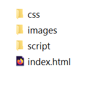
Let's try the following: copy the three lines above, place them in a new file and save this file with the name style.css in the css folder created in previous lessons.
Now, to apply this simple CSS code to the HTML document and actually see how the text changes color to red, we need to tell the index.html file where the stylesheet is located.
Basically, we need to create a link between index.html and style.css like this:
- Open the index.html file and somewhere in the head section (located between the <head></head> tags), place the following line:
<link href="css/style.css" rel="stylesheet">
- Save the index.html file and load it in the browser. You should see exactly what appears in the following example:

Anatomy of a CSS Rule
Let's analyze the code in the image below in detail.
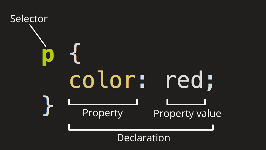
The entire structure is called a rule set, but most often it is simply referred to as a CSS rule. Let's see what individual elements make up a CSS rule:
- The selector – is represented by the name of the HTML element at the beginning of the rule set. It selects the element(s) to be styled (in our case <p>).
- The declaration – is represented by each line inside a rule. A CSS rule can contain multiple declarations. In our case, the declaration is represented by the line color: red; and it specifies one of the properties we want to modify.
- The property (properties) – are the ways through which we can style an existing HTML element. In our case, color is a property that can be applied to <p> elements. In CSS, we can choose which properties we want to modify for a specific element.
- The property value – is located to the right of the property, immediately after the colon(:) or separated by a single space. There are many CSS values we could use and which we will discuss later.
Let's also look at other important parts of CSS syntax:
- each CSS rule must be wrapped in curly braces({}), placed immediately after the selector and at the end of the rule, thus separating the rules from each other,
- within each declaration, the property is separated from its value by a colon(:),
- within each rule, declarations are separated from each other by adding a semicolon(;) at the end of each declaration.
So, to modify multiple values belonging to multiple properties simultaneously, we proceed as follows:
p {
  color: red;
  width: 600px;
  border: 1px solid orange;
}
Selecting Multiple Elements
We can also select several different elements at once and apply a single rule to all of them:
p, li, h1 {
  color: red;
}
Different Types of Selectors
There are many types of selectors.
Above we presented only element selectors, which select all elements of a certain type from the HTML document, but we can use more specific selectors. Here are some of the most commonly used types of CSS selectors:
| Selector Name | What It Selects | Example |
|---|---|---|
| Element Selectors | All HTML elements of the specified type | p - selects all <p> elements |
| ID Selector | The element on the page with the specified ID. It is recommended to use only one ID per element. Also, using the same ID more than once in the same HTML document is not allowed. | #my-id - selects <p id="my-id"> or <a id="my-id"> |
| Class Selector | The element on the page with the specified class. The class selector can be used repeatedly for various elements and multiple times in the same document. | .my-class - selects <p class="my-class"> or <a class="my-class"> |
| Attribute Selector | The element on the page with the specified attribute. | img[src] - selects <img src="myimage.png"> but not <img> |
| Pseudo-class Selector | The specified element(s), but only when in a specific state. | a:hover - Selects <a>, but only when the mouse pointer hovers over a link. |
There are many other selectors to explore, which we will discuss at the appropriate time.
Text and Fonts
Now that we've discussed some basic elements of CSS, let's start adding a few more rules and information to our style.css file so that our first website looks better.
Let's start by modifying the font so that our text looks a bit nicer:
- Add the following line in the <head></head> section:
<link href="https://fonts.googleapis.com/css?family=Open+Sans" rel="stylesheet">
The line above simply establishes a link between our page and a stylesheet from Google Fonts, which allows us to download the Open Sans font along with our page.
This way we can use this font in our own stylesheet.
- Now delete the existing rule from the styles.css file and add the following rule:
html {
  font-size: 10px; /* px = "pixels": we set the font height to 10px */
  font-family: "Open Sans", sans-serif;
}
The rule above sets the font size for the entire page (10 pixels in height) and sets the use of a global font, since the html selector is the parent element of the entire page and all elements will inherit the same font size and font type (family).
☞ Any text in a CSS document enclosed between /* and */ is a CSS comment, which the browser ignores when reading and rendering the code. This allows you to write useful notes to remind yourself later what the code does or to create separations between large blocks of code targeting different areas of the site.
- Now we will set different font sizes for HTML elements that contain text inside them — <h1>, <li>, and <p>. We will also center the title, set the line height (line-height), and increase the letter spacing (letter-spacing), all to make the text easier to read.
To do this, add the following lines of code to the style.css file:
h1 {
  font-size: 60px;
  text-align: center;
}

p, li {
  font-size: 16px;
  line-height: 2;
  letter-spacing: 1px;
}
You can adjust the values expressed in (px) to whatever values you want, so the design looks the way you like.
It's All About Boxes
Imagine that most HTML elements are actually boxes, stacked on top of each other or placed side by side.
In fact, that's exactly how it is.
It's no surprise that CSS layout is mainly based on the box model.
Each of the blocks (boxes) that occupy space on a web page has properties such as:
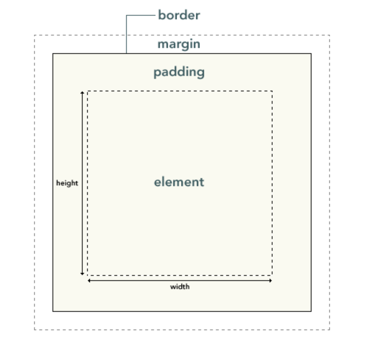
- padding – the space around the content (element);
- border – the solid line right at the edge of the padding;
- margin – the space outside the element or between elements;
- width – sets the width of an element;
- background-color – the color behind the element's content, including the padding;
- color – the color of an element's content (usually text);
- text-shadow – sets a shadow for the text inside an element;
- display – sets how an element is displayed (a more complex topic we'll discuss later).
So, let's start adding more properties to our page. Do this as a continuation of the rules already in the style.css file and even try changing the values to see what other stylistic results you can achieve.
Changing the Background Color
html {
  background-color: limegreen;
}
The rule above sets a background color for the entire page.
Add to the style.css file only the declaration background-color: limegreen; inside the html { } rule.
html {
  font-size: 10px; /* px = "pixels": we set the font height to 10px */
  font-family: "Open Sans", sans-serif;
  background-color: limegreen;
}
Page Body
body {
  width: 700px;
  margin: 0 auto;
  background-color: tomato;
  padding: 0 20px 20px 20px;
  border: 5px solid navy;
}
Let's go through the declarations above piece by piece:
- width: 700px; – forces the page body to always have a width of 600px,
- margin: 0 auto; – when we set two values on a property like margin or padding, the first value affects the top and bottom of the element (in our case 0), and the second value affects the left and right (auto – a special value that evenly distributes the available horizontal space between left and right). You can also use three or four values,
- background-color: tomato; – sets the background color of the element. You can experiment with other colors,
- padding: 0 20px 20px 20px; – as mentioned earlier, you can use four values for padding or margin. That's exactly what we did here to create some space on the left, right, and bottom,
- border: 5px solid black; – very simple here, a 5-pixel solid black border on all sides.
Positioning and Styling the Title
h1 {
  margin: 0;
  padding: 20px 0;
  color: limegreen;
  text-shadow: 3px 3px 1px black;
}
You may have noticed there's quite a bit of space at the top of the page. This happens because browsers apply default styling to the H1 element (among others).
To get rid of that space, we set the margin to 0.
Next, we set padding for the title on the top and bottom, and the title color to match the html (root element).
An interesting property we used here is text-shadow, which applies a shadow to the text inside the h1 element. The four values are interpreted as follows:
- the first value (3px) sets the horizontal offset of the text shadow to the right. A negative value (-3px) would move the shadow to the left;
- the second value (also 3px) sets the vertical offset, meaning it moves the shadow downward. A negative value would move the shadow upward;
- the third value (1px) sets the blur radius of the shadow;
- the fourth value sets the base color of the shadow.
Centering an Image
img {
  display: block;
  margin: 0 auto;
}
Finally, we will center the image to make it look better on our page.
We will use the same trick as above margin: 0 auto;, but we also need to do something else.
The <body> element is of type block, which means it occupies space on the page and can have margin and other spacing values applied by default.
Images are inline elements, the opposite of the block type described above.
So, to be able to apply a margin to the image, we need to change its behavior on the page, and we do this using the display property with the value block.
☞ The instructions above are valid if you use an image smaller than the 700px width set on the <body> element. If the image used is larger, it will overflow into the rest of the page. You can fix this by reducing the image size using a graphic editor or by reducing the image size (<img>) with CSS by setting the width property to a smaller value (400px for example – width: 400px;).
Don't worry too much if you don't fully understand the display: block; property. We will talk much more about it in the upcoming lessons.
Conclusion
If you followed the instructions correctly, the page we built together should look like this: