Web Forms 1 – Collecting Data from Users
Web forms are a very powerful tool for user interaction – most commonly used to collect data from users or to allow them to control a user interface. In this section, we will cover all essential aspects of web forms, including structuring with HTML, styling form controls, data validation, and sending data to the server.
Understanding and mastering the use of forms requires, in addition to HTML, knowledge of CSS and JavaScript. Therefore, after learning a bit of CSS and JavaScript, I recommend coming back and reviewing the information presented here to understand everything as clearly as possible.
What is a web form?
Forms allow users to enter data, which is generally sent to a web server for processing and storage, or used on the client side to immediately update the interface — for example, adding another item to a list or showing or hiding a UI feature.
The HTML part of a web form consists of one or more form controls (sometimes called widgets), plus a few additional elements that help with the overall structure — these are often referred to as HTML forms. Controls can be single-line or multi-line text fields, dropdown boxes, buttons, checkboxes, or radio buttons, and are mostly created using the <input> element, along with other elements we'll discuss.
Form controls can also be programmed to enforce specific required values and are associated with text labels that describe their purpose, both for sighted users and for visually impaired users.

Web Form Design
Before writing the code, it's a good idea to think about how your form will look. Designing a quick mockup (even a pencil sketch on paper) will help you define the right set of data you want to request from the user. From a user experience (UX) perspective, it's important to remember that the larger the form, the more frustrated users may become — and you risk losing some of them. Keep the form simple and ask only for the data you absolutely need.
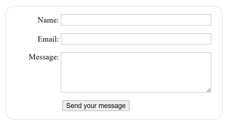
The form we'll build will contain three text fields and a single button. We'll ask the user for their name, email, and the message they want to send. Pressing the button will send the entered data to a web server for processing.
We'll use the following elements: <form>, <label>, <input>, <textarea> and <button>, along with a whole set of specific attributes.
The form element
All forms begin with a form element like this:
<form action="/form processing" method="post">
  ...
</form>
This element formally defines a form. It's a container-type element similar to section or footer, but specific to forms — it also accepts certain specific attributes to configure how the form behaves. All attributes are optional, but it's standard practice to always set at least the action and method attributes:
- The action attribute defines the location (URL) where the collected form data should be sent.
- The method attribute defines which HTTP method will be used to send the data — usually get or post.
The label, input, and textarea elements
Our contact form is not complex — the data entry section contains three text fields, each with a label tag:
- The input field for name is a single-line text field.
- The input field for email is an email-type input: a single-line text field that only accepts email addresses.
- The input field for message is a textarea element, a text field that accepts multiple lines.
Regarding the HTML code, to implement these form widgets we need the following lines of code:
<form action="/form processing" method="post">
   <ul>
    <li>
      <label for="name">Name:</label>
      <input type="text" id="name" name="user_name">
    </li>
    <li>
      <label for="mail">Email:</label>
      <input type="email" id="mail" name="user_mail">
    </li>
    <li>
      <label for="msg">Message:</label>
      <textarea id="msg" name="user_message"></textarea>
    </li>
   </ul>
</form>
We used li elements to conveniently structure the code and make styling the form easier (as we'll see shortly). For user-friendliness and accessibility, we include an explicit label for each form control. Note the use of the for attribute in all label elements, which takes the id of the associated form control as its value — this links a control to its label.
A major benefit of associating the label with form controls is that clicking the visible label text activates the corresponding control, also providing accessibility support for screen readers.
In our simple example, we use the <input / text> value for the first input — the default value for this attribute. It represents a single-line text field that accepts any kind of text.
For the second input, we use the <input / email> value, which defines a single-line text field that only accepts a properly formatted email address. This turns a basic text field into a sort of “smart” field that performs some validation checks on the user's input.
Lastly, note the syntax difference between the <input> and <textarea>...</textarea> elements. This is one of HTML's quirks. The input tag is a void element, meaning it doesn't require a closing tag, whereas textarea is not a void element and must be closed with a corresponding end tag. This affects a specific feature of forms — how you define the default value. To set a default value for an input element, you must use the value attribute like this:
<input type="text" value="by default this element is filled with this text">On the other hand, if you want to define a default value for a textarea element, you place it between the opening and closing tags of the element, like this:
<textarea>
    by default this element is filled with this text
</textarea>
The button element
The HTML markup for our form is almost complete. We just need to add a button to allow the user to submit the data after filling out the form. We do this using the <button> element. We'll add the following lines of code above the closing </ul> tag:
<li class="button">
    <button type="submit">Send Message</button>
</li>
The button element also accepts a type attribute — it can take one of three values: submit, reset, or button:
- Clicking a submit button with the value submit (the default value) sends the form data to the web page defined by the form element's action attribute (in our case, "form-processing").
- Clicking a reset button immediately resets all form widgets to their default values. From a UX (User Experience) perspective, this is considered poor practice, so you should avoid using this type of button unless you have a truly good reason to include one.
- Clicking a button with the value button does nothing! That sounds strange, but it's surprisingly useful for building custom buttons — you can define the desired functionality with JavaScript.
☞ You can also use the <input> element with the appropriate type to produce a button, for example <input type="submit">. However, the <button> element allows full HTML content, enabling more complex and creative button designs, while the <input> element only allows plain text.
At this point, our form looks rather unfriendly, just like in the image below:
Simple Form Styling
It's well known that forms are quite tricky to style nicely — but it's not impossible. For now, we'll apply a few simple styles, and later in the CSS course, we'll build some truly beautiful forms.
We'll write all the CSS code internally, in the head section between the style tags:
  <style>
    ...
  </style>
</head>
The CSS code for our form is:
form {
/* Center the form on the page and limit its width */
  margin: 0 auto;
  width: 400px;
/* Add a border and some padding around it */
  padding: 1em;
  border: 1px solid #CCC;
  border-radius: 1em;
}

ul {
  list-style: none;
  padding: 0;
  margin: 0;
}

/* Add spacing between text fields */
form li + li {
  margin-top: 1em;
}

label {
/* Standardize label size and alignment */
  display: inline-block;
  width: 90px;
  text-align: right;
}

input,
textarea {
/* Ensure consistent font settings for all text fields. Default font is monospace */
  font: 1em sans-serif;
/* Standardize text field dimensions */
  width: 300px;
  box-sizing: border-box;
/* Standardize field borders */
  border: 1px solid #999;
}

input:focus,
textarea:focus {
/* Additional highlight for focus state */
  border-color: #000;
}

textarea {
/* Align text lines with labels */
  vertical-align: top;
/* Provide space for the message text */
  height: 5em;
}

.button {
/* Horizontally align the button with text fields *∕
  padding-left: 90px; /* same size as labels */
}

button {
/* Vertically align the button */
  margin-left: .5em;
}
Now we can see how our live form looks:
Sending Collected Data to the Web Server
The final part — and perhaps the most challenging — is handling the form data on the server side. The form element defines where and how to send the data using the action and method attributes.
We assign a name to each form control. Names are important for both the client and the server. They tell the browser what name to assign to each piece of data, and on the server side, they allow the server to manage each piece of information by name. Form data is sent to the server as name/value pairs.
To name the data in a form, you must use the name attribute on each form widget that collects a specific piece of data. Let's take another look at the form code:
<form action="/form processing" method="post">
   <ul>
    <li>
      <label for="name">Name:</label>
      <input type="text" id="name" name="user_name"> <!‐‐ (user_name) ‐‐>
    </li>
    <li>
      <label for="mail">Email:</label>
      <input type="email" id="mail" name="user_mail"> <!‐‐ (user_mail) ‐‐>
    </li>
    <li>
      <label for="msg">Message:</label>
      <textarea id="msg" name="user_message"></textarea> <!‐‐ (user_message) ‐‐>
    </li>
   </ul>
</form>
In our example, the form will send 3 pieces of data named user_name, user_mail, and user_message. These values will be sent to the URL /page-processing using the HTTP POST method.
On the server side, the script at the URL /page-processing will receive the data as a list of 3 key/value pairs contained in the HTTP request. How this script handles the data depends on the developer and the programming language used. Each server-side language (PHP, Python, Ruby, Java, C#, etc.) has its own mechanism for handling form data. We'll discuss server-side data processing later when we use concrete examples. This topic will also be covered in much greater detail in the courses dedicated to each server-side language we explore.
This is just the beginning — now it's time to take a deeper look. Forms have much more power than what we've seen here, and the next articles in this module will help you master that power.
How to Properly Structure a Web Form
The flexibility of forms makes them among the most complex structures in HTML. You can build any kind of form using dedicated elements and attributes. Using a proper structure when building an HTML form will help ensure that the form is usable and accessible for all types of users.
It's always possible to use a form control outside of a form element. If you do this, by default the control isn't associated with any form unless you explicitly link it using the form attribute. This was introduced to allow you to explicitly associate a control with a form even if it's not nested inside it.
The fieldset and legend Elements
The <fieldset> element is a convenient way to group widgets that serve the same purpose, for styling and semantic reasons. You can label a <fieldset> by including a <legend> element directly after the opening <fieldset> tag. The text content of the <legend> formally describes the purpose of the enclosing <fieldset>.
Many assistive technologies treat the <legend> element as part of the label for each control inside the corresponding <fieldset>. For example, some screen readers like JAWS and NVDA will announce the legend content before reading each control's label.
Let's look at the code for a simple example:
<form>
  <fieldset>
    <legend>HTML Course</legend>
    <p>
      <input type="radio" name="curs" id="curs_1" value="beginner">
      <label for="curs_1">Beginner</label>
    </p>
    <p>
      <input type="radio" name="curs" id="curs_2" value="intermediary">
      <label for="curs_2">Intermediate</label>
    </p>
    <p>
      <input type="radio" name="curs" id="curs_3" value="advanced">
      <label for="curs_3">Advanced</label>
    </p>
  </fieldset>
</form>
And here you can see a live example:
When reading the form above, a screen reader will say:
- HTML Course beginner – for the first widget,
- HTML Course intermediate – for the second,
- HTML Course advanced – for the third.
The use case in this example is one of the most important. Whenever you have a set of radio buttons, you should nest them inside a fieldset element. There are other use cases as well, and in general, the fieldset element can also be used to section a form. Ideally, long forms should be spread across multiple pages, but if a form becomes long and must remain on a single page, placing related sections into separate fieldset blocks improves usability.
Due to its impact on assistive technology, the fieldset element is one of the key elements for building accessible forms. However, it's our responsibility not to overuse it. Whenever you create a form, try listening to how it's interpreted by a screen reader. If it sounds awkward, consider improving the form's structure.
The label Element
As we saw earlier, the label element is the formal way to define a label for an HTML form widget. It's the most important element if you want to build accessible forms — when implemented correctly, screen readers will announce the label of a form element along with its instructions, and it's also helpful for sighted users. Let's revisit an example we saw above:
<label for="name">Name:</label>
<input type="text" id="name" name="user_name">
When the label is correctly associated with the input using the for attribute (which
matches the id of the input element), a screen reader will say something like "Name, edit
text".
In this example, we're talking about the association for="name" with id="name".
There's another way to associate a form control with a label — by nesting the form control inside the <label>...</label> element, in which case the association is implicit and even more obvious:
<label for="name">
  Name:<input type="text" id="name" name="user_name">
</label>
Even in such cases, it's considered best practice to set the for attribute to ensure that all assistive technologies understand the relationship between the label and the widget.
If there's no label, or if the form control isn't implicitly or explicitly associated with a label, a screen reader will say something like “Edit empty text,” which is not helpful at all.
Another advantage of properly setting labels is that you can click or tap the label to activate the corresponding widget. This is useful for controls like text inputs, where you can click the label to focus the field, but it's especially helpful for radio buttons and checkboxes — the clickable area of such controls can be very small, so it's useful to make them easier to activate.
In the example below, if we click the label "Prefer cherries", it will toggle the selected state of the checkbox taste_cherry:
Multiple Labels
Strictly speaking, we can place multiple labels on a single widget, but this is not a good idea, as some assistive technologies may have trouble handling them. In cases with multiple labels, you should nest the widget and its labels inside a single <label> element.
Let's look at the following example:
<p>Required fields are followed by <abbr title="required">*</abbr>.</p>

  <!‐‐ Version 1 ‐‐>
  <div>
    <label for="username">Name:</label>
    <input type="text" name="username">
    <label for="username"><abbr title="required" aria-label="required">*</abbr></label>
  </div>

  <!‐‐ Version 2 – slightly better ‐‐>
  <div>
    <label for="username">
      <span>Name:</span>
      <input id="username" type="text" name="username">
      <abbr title="required" aria-label="required">*</abbr>
    </label>
  </div>

  <!‐‐ Version 3 – probably the best ‐‐>
  <div>
    <label for="username">Name: <abbr title="required" aria-label="required">*</abbr></label>
    <input id="username" type="text" name="username">
  </div>
You can see the three versions in the editor below:
The paragraph at the top provides a rule for required fields.
This rule should be included before it's used, so that both sighted users and assistive technology users (like screen readers) understand what it means before encountering a required field.
Although this helps inform users about what the asterisk means, we can't rely on it alone. A screen reader will announce an asterisk as “star” when it encounters it.
When a sighted user hovers the mouse over it, the text "required" should appear, thanks to the title attribute.
Titles read aloud depend on the screen reader's settings, so it's more reliable to also include the aria-label attribute, which is always read by screen readers.
The examples above increase in effectiveness from top to bottom:
- In the first example, the label isn't read at all — we get only "edit text blank", and the actual labels are read separately. Multiple label elements create confusion for screen readers.
- In the second example, things are a bit clearer — the label read with the input is: "name star name edit text required", and labels are still read separately. It's still a bit confusing, but better, since the input has an associated label.
- The third example is the best — the label is read together with the input, and the result is: "name required edit text".
Common HTML Structures Used for Forms
Beyond the specific structures of web forms, it's important to remember that form markup is just HTML. This means you can use the full power of HTML to structure a web form.
As you can see in the examples, it's common practice to wrap a label and its widget inside a <li> element within a <ul> or <ol> list. The <p> and <div> elements are also frequently used. Lists are recommended for structuring multiple checkboxes or radio buttons.
In addition to the <fieldset> element, it's also common to use HTML headings (e.g., <h1>, <h2>) and sectioning elements (e.g., <section>) to structure complex forms.
We can also build a form using HTML tables, with the note that the form element must always be placed outside the table element. However, this method is only recommended in special cases.
<form action="" method="" id="myForm" name="myForm">
  <table>
   ...
  </table>
</form>
Above all, it's up to you to find a coding style that leads to accessible and usable forms. Sections with different functionality should be contained within a separate <section> element, with <fieldset> elements for areas with radio buttons.
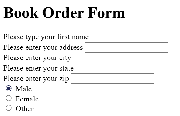
Example of a form built using an HTML table:
In the example below, you can see how a payment form is built:
Native Form Controls
We've already encountered several form elements, including <form>, <fieldset>, <legend>, <textarea>, <label>, <button>, and <input>.
Next, we'll look at other input types such as: button, checkbox, file, hidden, image, password, radio, reset, submit, and text, along with a set of common attributes shared by all types of form controls.
Text Input Fields
Input text fields are the most basic form widgets. They're a very convenient way to allow users to enter any kind of data, and we've already seen a few simple examples.
All basic text controls share some common behaviors:
- They can be marked as readonly (the user cannot modify the input value, but it is still submitted with the rest of the form data) or disabled (the input value cannot be modified and is never submitted with the rest of the form data).
- They can have a placeholder — this is text that appears inside the input box, meant to briefly describe the purpose of that field.
- They can be restricted by size (the physical size of the box) and maximum length (the maximum number of characters that can be entered).
- They can benefit from spell checking (using the spellcheck attribute), if supported by the browser.
☞ The <input> element is unique among HTML elements because it can take many different forms depending on the value of the type attribute. It's used to create most types of form widgets, including single-line text fields, time and date controls, non-text inputs like checkboxes, radio buttons, color pickers, and buttons.
Single-Line Text Fields
A single-line text field is created using an input element whose type attribute is set to text, or by omitting the type attribute entirely (text is the default value). The value of this attribute also serves as a fallback if the specified type is unknown to the browser (for example, if you specify type="color" and the browser doesn't support color selection).
Let's now look at an example of a single-line text field:
<input type="text" id="comment" name="comment" value="I am a text field">Single-line text fields have one limitation: if you enter text with line breaks, the browser will remove those breaks before sending the data to the server.
Password Field
One of the earliest input types was the password text field:
<input type="password" id="pwd" name="pwd">The password value doesn't impose any special restrictions on the entered text, but it hides the value (e.g., with dots or asterisks), so it can't be easily read by others.
Note that this is just a user interface feature — unless you submit the form securely, the data will be sent in plain text, which is bad for security. Malicious actors could intercept the data and steal passwords, credit card details, or anything else you've submitted. To protect users from these risks, you should run pages with forms over a secure connection (using the https:// protocol), so the data is encrypted before being sent.
Browsers recognize the security implications of submitting form data over an insecure connection and display warnings to discourage users from using unsafe forms.
Hidden Content
This is used to create a form control that is invisible to the user but still submitted to the server along with the rest of the form data — for example, you might want to send the time an order was placed (server time). Since it's hidden, the user can't see or edit the value, it never receives focus, and a screen reader won't detect it.
<input type="hidden" id="timestamp" name="timestamp" value="214900512">For such an element, you must set the name and value attributes. Hidden input types don't need an associated label.
Other text input types like search, url, and tel were introduced in HTML5 and we'll discuss them later.
Checkboxes and Radio Buttons
These are controls whose state can be changed by clicking on them or their associated labels. There are two types: checkbox and radio button. Both use the checked attribute to indicate whether the widget is selected by default.
It's worth noting that these widgets behave differently from other form widgets. For most form widgets, once the form is submitted, all widgets with a name attribute are sent — even if no value was entered. In the case of checkboxes and radio buttons, their values are sent only if they are checked. If they're not checked, nothing is sent — not even their name. If they are checked but have no value, the name is sent with the value “on”.
For maximum usability and accessibility, it is recommended to wrap each list of items or similar options inside a <fieldset>, with a <legend> that provides a general description of the list. Each <label> / <input> pair should be contained in its own list item.
Checkbox
A checkbox is created using the input element with a type attribute set to checkbox.
<input type="checkbox" id="apples" name="apples" value="apples" checked>Including the checked attribute displays a pre-selected (checked) box automatically when the page loads. When we click on the checkbox or its associated label, we toggle the box on or off.
Due to the on-off nature of checkboxes, they are considered toggle buttons, which is why many developers and designers customize the default styling to create buttons that look like switches — as shown in the example below:
Radio Button
A radio button is created using the input element with its type attribute set to radio:
<input type="radio" id="apples" name="fruits" checked>Multiple radio buttons can be grouped together. If they share the same value for their name attribute, they are considered part of the same group. Only one button in a given group can be selected — this means that when one is checked, all others are automatically unchecked. When the form is submitted, only the value of the selected radio button is sent. If none are selected, the entire radio group is considered to be in an unknown state and no value is sent with the form. Once one of the radio buttons in a group is selected, the user cannot deselect all of them without resetting the form.
The radio button isn't actually a button, despite its name — so let's move on and look at real buttons! There are three input types that produce buttons:
- submit – <button type="submit">
- Sends the form data to the server. For <button> elements, omitting the type attribute (or using an invalid value) results in a submit button.
- reset – <button type="reset">
- Resets all form widgets to their default values.
- button – <button type="button">
- Buttons that have no automatic effect, but can be customized using JavaScript code.
Additionally, the <input> element can use a type attribute to mimic these three button types. The main difference between the two is that <button> elements are much more stylable.
Below you can see examples for each button type:
submit
<button type="submit">
    This is a <strong>submit</strong> button
</button>

<input type="submit" value="This is a submit button">
reset
<button type="reset">
    This is a <strong>reset</strong> button
</button>

<input type="reset" value="This is a reset button">
anonymous
<button type="button">
    This is an <strong>anonymous</strong> button
</button>

<input type="button" value="This is an anonymous button">
Buttons always behave the same, whether we use a button element or an input element. As you can see from the examples, button elements allow you to use HTML in their content, which is placed between the opening and closing <button>...</button> tags. input elements, on the other hand, are empty elements — the displayed content is inserted via the value attribute and therefore only supports plain text.
Image Button
The image button is rendered just like an <img> element, except that when the user clicks it, it behaves like a submit button.
An image button is created using an input element with its type attribute set to image. This element accepts exactly the same set of attributes as an <img> element, plus all attributes supported by other form buttons.
<input type="image" alt="Click here!" src="image.png" width="75" height="30"File Picker
There is one final input type — the file picker. Forms can send files to a server. The file selection widget can be used to choose one or more files to upload.
To create a file picker widget, we use the input element with its type attribute set to file. Accepted file types can be restricted using the accept attribute. Additionally, if you want to allow the user to select more than one file, you can do so by adding the multiple attribute.
In the example below, a file picker is created that requests image files. The user can select multiple files in this case:
<input type="file" name="file" id="file" accept="image/*" multiple>On some mobile devices, the file picker can access photos, videos, and audio captured directly from the device's camera and microphone by adding capture information to the accept attribute like this:
<input type="file" accept="image/*;capture=camera">
<input type="file" accept="video/*;capture=camcorder">
<input type="file" accept="audio/*;capture=microphone">
Common Attributes
Many of the elements used to define form controls have their own specific attributes. However, there is a set of attributes common to all form elements. You've already encountered some of these, but below is a list of common attributes for your reference:
- autofocus – this boolean attribute allows you to specify that the element should automatically receive input focus when the page loads. Only one form-associated element in a document can have this attribute specified.
- disabled – this boolean attribute indicates that the user cannot interact with the element. If this attribute is not specified, the element inherits its setting from its container — for example, a fieldset. If no container element has the disabled attribute, then the element is enabled.
- form – the form element associated with the widget, used when the control is not nested inside the form. The value of this attribute must be the id of a form element in the same document. This allows you to associate a form control with a form outside of its current container.
- name – the name of the element — this is sent with the form data.
- value – the initial value of the element.
HTML5 Input Types
In the previous article, we looked at the input element, which covers the original values of the type attribute available since the early days of HTML. Now we'll take a closer look at the functionality of newer form controls, including some input types added in HTML5 to support the collection of specific kinds of data.
Email Address Field
<input type="email" id="email" name="email">When this type is used, the user is required to enter a valid email address. Any other content causes the browser to display an error when the form is submitted.
You can also use the multiple attribute in combination with the email input type to allow the entry of multiple email addresses in the same field (separated by commas):
<input type="email" id="email" name="email" multiple>Client-Side Validation
As you can see in the image above, the email input is highlighted in red because a valid email address was not entered, and client-side error validation is performed by the browser before the data is sent to the server. This is a helpful feature to guide users in accurately completing a form.
This security measure is superficial! Your applications should always perform security checks on any data submitted via a form — both on the server side and the client side — because client-side validation is too easy to disable, allowing malicious users to easily send harmful data to the server.
Note that a @ b is considered a valid email address according to the default constraints provided. This is because the email input type implicitly allows intranet-style email addresses. To implement different validation behaviors, you can use the pattern attribute and also customize error messages — we'll discuss how to use these features a bit later.
Search Field
Search fields are used to create search boxes in pages and applications. This type of field is set using the search value for the type attribute:
<input type="search" id="search" name="search">The main difference between a text field and a search field is how the browser styles their appearance. Search fields are often rendered with rounded corners and may also display a "Ⓧ" icon that clears the entered value when clicked.
Phone Number Field
A special field for entering phone numbers can be created using tel as the value of the type attribute:
<input type="tel" id="tel" name="tel">When accessed via a touch device with a dynamic keyboard, most devices will display a numeric keypad when encountering type="tel".
Due to the many phone number formats used around the world, this field type does not enforce any restrictions on the value entered by the user (letters can be entered as well).
As mentioned earlier, the pattern attribute can be used to enforce constraints.
URL Field
A special field for entering web addresses can be created using url as the value for the type attribute:
<input type="url" id="url" name="url">This adds special validation constraints to the field. The browser will report an error if no protocol is entered (such as http:) or if the URL is not in a correct format.
Number Field
Controls for entering numbers can be created using the number input type. This control looks like a text field but only allows numeric input and usually displays buttons to increase or decrease the entered value.
With the number input type, you can restrict the allowed minimum and maximum values by setting the min and max attributes.
You can also use the step attribute to define the increment and decrement value when the displayed buttons are pressed. By default, number input is only validated if the value is an integer. To allow decimal numbers, specify step="any". If omitted, the default step value is 1, meaning only whole numbers are valid.
Let's look at a few examples. The first creates a number control whose value is restricted to any number between 1 and 100, and whose increment/decrement buttons change the value by 2:
<input type="number" name="age" id="age" min="1" max="100" step="2">The second creates a number control whose value is restricted to any number between 0 and 1 inclusive, and whose increment/decrement buttons change the value by 0.01:
<input type="number" name="change" id="pennies" min="0" max="1" step="0.01">The number input type makes sense when the range of valid values is limited — for example, a person's age or height.
Slider Controls
Another way to choose a number is by using a slider. You see them quite often on websites, and they allow you to set a minimum or maximum value. Let's look at a live example to illustrate this:
Sliders are less precise than text fields. Therefore, they are used to select a number whose exact value is not necessarily important.
It's important to configure the slider correctly. For this purpose, it's recommended to set the min, max, and step attributes.
<input type="range" id="myRange" name="demo" min="1" max="1000" value="500" class="slider">One issue with sliders is that they don't provide any visual feedback regarding the current value. That's why we included a few lines of JavaScript in our example:
<script>
  var slider = document.getElementById("myRange");
  var output = document.getElementById("demo");
  output.innerHTML = slider.value;

  slider.oninput = function() {
    output.innerHTML = this.value;
  }
</script>
Date and Time Picker
Getting date and time values has traditionally been a nightmare for web developers. For a good user experience, it's important to provide a calendar-style user interface that allows users to select dates without needing to switch to a native calendar app or enter them in various hard-to-parse formats.
HTML date controls are available to handle this kind of specific data, offering calendar widgets and standardizing the format.
A date and time control is created using the input element and an appropriate value for the type attribute, depending on what you want to collect — date, time, or both. Here's a live example using select elements:
Note that using these types is fairly complex, especially when considering browser support. For full details, you can visit the MDN web docs.
Let's briefly review the available types:
datetime-local
Creates a widget for displaying and selecting date and time, without any timezone-specific information.
<input type="datetime-local" name="datetime" id="datetime">month
Creates a widget for displaying and selecting a month and year.
<input type="month" name="month" id="month">time
Creates a widget for displaying and selecting a time value.
<input type="time" name="time" id="time">week
Creates a widget for displaying and selecting a week and year.
<input type="week" name="week" id="week">Limiting date/time values
All date and time controls can be restricted using the min and max attributes, with additional constraints possible via the step attribute (whose value is given in seconds).
<label for="myDate">When are you available this summer?</label>
<input type="date" name="myDate" min="2020-06-01" max="2020-08-31" step="3600" id="myDate">
Browser support for date/time inputs
You should know that date and time widgets don't have the best browser support. Currently, Chrome, Firefox, Edge, and Opera support them well, but older versions of Internet Explorer do not.
Color Picker Control
Colors are always a bit tricky to handle. There are many ways to express them: RGB values (decimal or hexadecimal), HSL values, keywords, etc.
You can create a color control using the input element with its type attribute set to color:
<input type="color" name="color" id="color">When supported, clicking on a color control will display the default color picker functionality from your operating system.
Below is a live example:
Other Form Controls
Multi-line Text Fields
A multi-line text field is specified using a <textarea> element, not by using the input element.
<textarea name="textarea" cols="50" rows="4">Write something here</textarea>The main difference between a textarea and a single-line text field is that users are allowed to include line breaks by pressing enter, and these will be included when the data is submitted.
Textarea also has a closing tag, and any text you want it to contain should be placed between the opening and closing tags. In contrast, input is a void element with no closing tag — any default value is placed in the value attribute.
Note that although you can place anything inside a textarea element (including other HTML, CSS, and JavaScript elements), due to its nature, everything is rendered as plain text. Using the contenteditable attribute provides an API for capturing HTML/"rich" content instead of plain text.
Visually, the text is wrapped, and the form can be resized by default. Modern browsers provide a drag handle that you can pull to increase or decrease the size of the text area.
Multi-line Rendering Control
Textarea supports three attributes to control how text is rendered across multiple lines:
- cols
- Specifies the visible width (columns) of the text control, measured in average character widths. This is effectively the starting width, as it can be changed by resizing the textarea and overridden using CSS. The default value if none is specified is 30.
- rows
- Specifies the number of visible text rows. This is effectively the starting height, as it can be changed by resizing the textarea and overridden using CSS. The default value if none is specified is 10.
- wrap
- Specifies how the text is wrapped. Accepted values are hard, soft, and off. The off value does not create line breaks and causes a horizontal scroll bar to appear.
Textarea Resize Control
The ability to resize a textarea control is managed using CSS resize properties. Possible values are:
- both – default – allows both horizontal and vertical resizing,
- horizontal – allows only horizontal resizing,
- vertical – allows only vertical resizing,
- none – disables resizing,
- block and inline – experimental values that allow resizing only in the block or inline direction (depending on text direction).
Drop-down Controls
Drop-down controls are a simple way to allow users to select from multiple options without taking up much space in the user interface. HTML provides two types of drop-down content: the select box and the autocomplete box. In both cases, the interaction is the same — once the control is activated, the browser displays a list of values for the user to choose from.
You can see more examples in the editor below.
Select Box
A simple select box is created using a <select> element with one or more <option> child elements, each specifying one of its possible values:
<select id="simple" name="simple">
  <option>Apples</option>
  <option selected>Pears</option>
  <option>Plums</option>
</select>If needed, the default value for the select box can be set using the selected attribute on the desired <option> element — this option will then be preselected when the page loads.
<option> elements can be wrapped inside <optgroup> elements to create visually grouped sets of values:
<select id="groups" name="groups">
  <optgroup label="fruits">
    <option>Apples</option>
    <option selected>Pears</option>
    <option>Plums</option>
  </optgroup>
  <optgroup label="vegetables">
    <option>Carrots</option>
    <option>Potatoes</option>
    <option>Beets</option>
  </optgroup>
</select>On the optgroup element, the value of the label attribute is displayed before the values of the nested options. The browser styles the content of the label element differently so that it cannot be mistaken for actual options.
If an option element has an explicit value attribute set, that value is sent when the form is submitted with that option selected. If the value attribute is omitted, as in the examples above, the content of the option element is used as the value. Therefore, value attributes are not required, but you may find a reason to send a shortened or different value to the server than what is visually displayed in the selected option.
For example:
<select id="simple" name="simple">
  <option value="apples">Large and beautiful Golden Apples</option>
  <option value="plums">Ripe and juicy President Plums</option>
  <option value="pears">Williams Pears with white, juicy, aromatic flesh</option>
</select>By default, the height of the select box is enough to display a single value. The optional size attribute gives more control over the visible options when the selection is not focused.
Select Box with Multiple Options
By default, a select box allows the user to choose a single value. By adding the multiple attribute to the select element, you can allow users to select multiple values using the default mechanism provided by the operating system (for example, by holding down the Ctrl key and clicking on multiple values).
<select id="multi" name="multi" multiple size="2">
  <optgroup label="fruits">
    <option>Apples</option>
    <option selected>Pears</option>
    <option>Plums</option>
  </optgroup>
  <optgroup label="vegetables">
    <option>Carrots</option>
    <option>Potatoes</option>
    <option>Beets</option>
  </optgroup>
</select>☞ In the case of select boxes with multiple options, you will notice that the select box no longer displays values as a dropdown — instead, all values are shown simultaneously in a list, with the optional size attribute determining the height of the widget. All browsers that support the select element also support the multiple attribute.
Autocomplete Box
You can provide suggested, auto-completed values for form widgets using the <datalist> element with child <option> elements to specify the values to display. The datalist must have an ID.
The datalist is then linked to an <input> element (for example, a text input or an email input type) using the list attribute, whose value is the ID of the datalist it connects to.
Once a datalist is associated with a form widget, its options are used to autocomplete the text entered by the user; typically, this is presented to the user as a dropdown box showing matches for what they've typed into the input.
Let's look at an example:
<label for="myFruit">What are your favorite fruits?</label>
  <input type="text" name="myFruit" id="myFruit" list="mySuggestion">
    <datalist id="mySuggestion">
      <option>Apples</option>
      <option>Pears</option>
      <option>Plums</option>
      <option>Apricots</option>
      <option>Kiwi</option>
      <option>Peaches</option>
      <option>Bananas</option>
      <option>Cherries</option>
</datalist>Counters and Progress Bars
Progress Bars
Counters and progress bars are visual representations of numeric values.
A progress bar represents a value that changes over time up to a maximum value specified by the max attribute. Such a bar is created using a <progress> element:
<progress max="100" value="75">75/100</progress>
It is used for anything that requires reporting progress, such as the total percentage of files downloaded or the number of questions completed in a survey.
The content inside the progress element is an alternative for browsers that do not support the element and for screen readers that will read it aloud.
Counters
A meter bar represents a fixed value within a range defined by the min and max values. This value is visually rendered as a bar, and to understand how the bar looks, we compare the value with other set values:
- The low and high values divide the range into three parts:
- The lower part of the range is between the minimum and low values, inclusive.
- The middle part of the range is between the low and high values, exclusive.
- The upper part of the range is between the high and maximum values, inclusive.
- The optimum value defines the optimal value for the meter element. In combination with the low and high values, it defines which part of the range is preferred:
- If the optimum value is in the lower part of the range, the lower range is considered preferred, the middle range is considered average, and the upper range is considered worst.
- If the optimum value is in the middle part of the range, the lower range is considered average, the middle range is considered preferred, and the upper range is also considered average.
- If the optimum value is in the upper part of the range, the lower range is considered worst, the middle range is considered average, and the upper range is considered preferred.
All browsers that implement the meter element use these values to change the color of the meter bar:
- If the current value is in the preferred part of the range, the bar is green.
- If the current value is in the average part of the range, the bar is yellow.
- If the current value is in the worst part of the range, the bar is red.
Such a bar is created using a <meter> element. It is used to implement any type of counter, for example a bar that shows the total space used on a disk, which turns red when it starts to fill up.
<meter min="0" max="100" value="50" low="33" high="66" optimum="50">75</meter>
<meter min="0" max="100" value="70" low="33" high="66" optimum="50">70</meter>
<meter min="0" max="100" value="90" low="33" high="66" optimum="32">90</meter>The content inside the meter element is an alternative for browsers that do not support the element and for assistive technologies that read it aloud.