CSS Box Styling
All HTML elements are “contained” within a box created by CSS. Understanding these boxes is key to building efficient and flexible layouts in CSS.
In this section, we will explore the box model in depth, which will allow us to create increasingly complex layouts and understand how it works along with the terminology used.
Block and Inline-Block Boxes
In CSS, there are two main types of boxes: block boxes and inline boxes, each with different behaviors and characteristics, both individually and in relation to other elements on the page.
A block box behaves as follows:
- It stretches horizontally to fill all available space in its parent container. Most of the time, it will have the same width as the container, occupying 100% of the available space.
- It creates a line break before and after the element.
- The width and height properties apply.
- The padding, margin, and border properties affect the positioning of surrounding elements, pushing them according to the defined spacing.
Elements such as H1 headings or p paragraphs are, by default, block elements. This behavior can be changed using the display property with the value inline.
An inline box behaves as follows:
- It does not create a line break.
- The width and height properties do not apply.
- The padding, margin, and border properties apply, but they do not affect the positioning of other inline elements around it.
- Elements like a, em, strong, and span are, by default, inline elements.
The type of box applied to an element is determined by the display property values: block, inline, and inline-block.

Types of Inner and Outer Display
Now is a suitable moment to explain and differentiate the types of inner and outer display.
As mentioned earlier, boxes have an outer display type, which indicates whether the element is of type block or inline.
Additionally, boxes have an inner display type, which dictates how the elements inside that container are arranged.
By default, elements inside a box are arranged in normal flow (normal flow), which means they will behave like any other block or inline element.
However, we can modify the inner display type using values such as flex. If we apply display: flex; to an element, the outer display type remains block, and the inner display becomes flex. All direct children of that container will become flex items and behave according to the rules of the Flexbox specification, which we will discuss in more detail in the following sections.
The most important aspect to remember is that, in the absence of other CSS rules, block and inline displays represent the default behaviors on the web — that is, the normal flow mentioned above.
Below we have three different HTML elements, all with an outer display type of block:
The first is a paragraph with a CSS-defined border. The browser displays it in a block box, which means it starts on a new line and stretches to the full available width.
The second element is a list with flex display, which establishes a flexible layout for the elements inside the container. The list itself remains of type block, so it stretches to full width and is displayed on its own line.
The last paragraph is also of type block, and inside it there are two span elements. These are inline by default, but one of them has a class assigned that changes the display to block.
In the example below, we can observe the behavior of inline elements.
The span element in the first paragraph is, by default, inline, so it does not force a line break.
We also have a ul element with the display: inline-flex; setting, which creates a
flexible box around the elements inside.
Finally, there are two paragraphs with the display: inline; setting. The inline-flex
container and the two paragraphs are displayed on the same line, instead of creating a line break as would
happen if they had display: block;.
You can modify the different display types to observe behavior in various situations.
What should be remembered from the examples above is that changing the value of the display
property can change the outer display mode to block or inline, thus
influencing relationships with surrounding elements.
Next, we will focus on the outer display type.
What is the CSS box model?
The complete CSS box model applies to block elements, while inline elements use only part of this model.
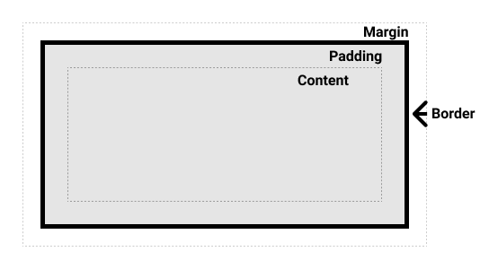
Essentially, this model defines how the different components of a CSS box — margin, border, padding, and content — interact to form a visible box on the page.
There are two variants of the model: the standard model and the alternative model.
Normally, a CSS box consists of:
- Content box – the area where content is displayed, sized using properties such
as
widthandheight. - Padding box – the white space around the content.
- Border box – wraps the content and padding.
- Margin box – the outermost layer, which creates space between boxes.
The image below is illustrative:
The standard CSS box model
In the standard model, if we set a width and height for a box, these define the dimensions of the content box. Padding (padding) and border (border) are added on top of these dimensions to calculate the total size of the box.
Assume we have the following CSS box:
.box {
  width: 350px;
  height: 150px;
  margin: 25px;
  padding: 25px;
  border: 5px solid black;
}
The total width of this box is 410px (350 + 25 + 25 + 5 + 5), and the height is 210px (150 + 25 + 25 + 5 + 5), resulting from adding padding and border to the initial dimensions.
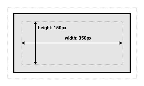
☞ The margin (margin) is not included in the calculation of the total box size. It affects the space occupied on the page, but it is considered outside the box. The box stops at the border.
The alternative CSS box model
It is quite inconvenient to always add padding and border to calculate the total box size.
For this reason, the alternative CSS box model was introduced.
In this model, the set size represents the total size of the visible box. Padding and border are subtracted from the content size.
The same CSS box above will have, in this case, a width of 350px and a height of 150px.
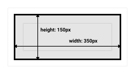
By default, browsers use the standard model. To activate the alternative model, the
box-sizing: border-box; property is used, which tells the browser to include padding and border in
the total size.
.box {
  box-sizing: border-box;
}
If you want all boxes on the page to use the alternative model, apply this rule to the html
element and make all other elements inherit it:
html {
  box-sizing: border-box;
}
*, *::before, *::after {
  box-sizing: inherit;
}
Practice the box models
In the following example, there are two CSS boxes. Both have the .box class, which applies the same dimensions.
The only difference is that the alternative CSS box model was set for the second box.
The challenge is to modify the dimensions of the second box by adding CSS code to the .alternate class so that it reaches the same width and height as the first box.
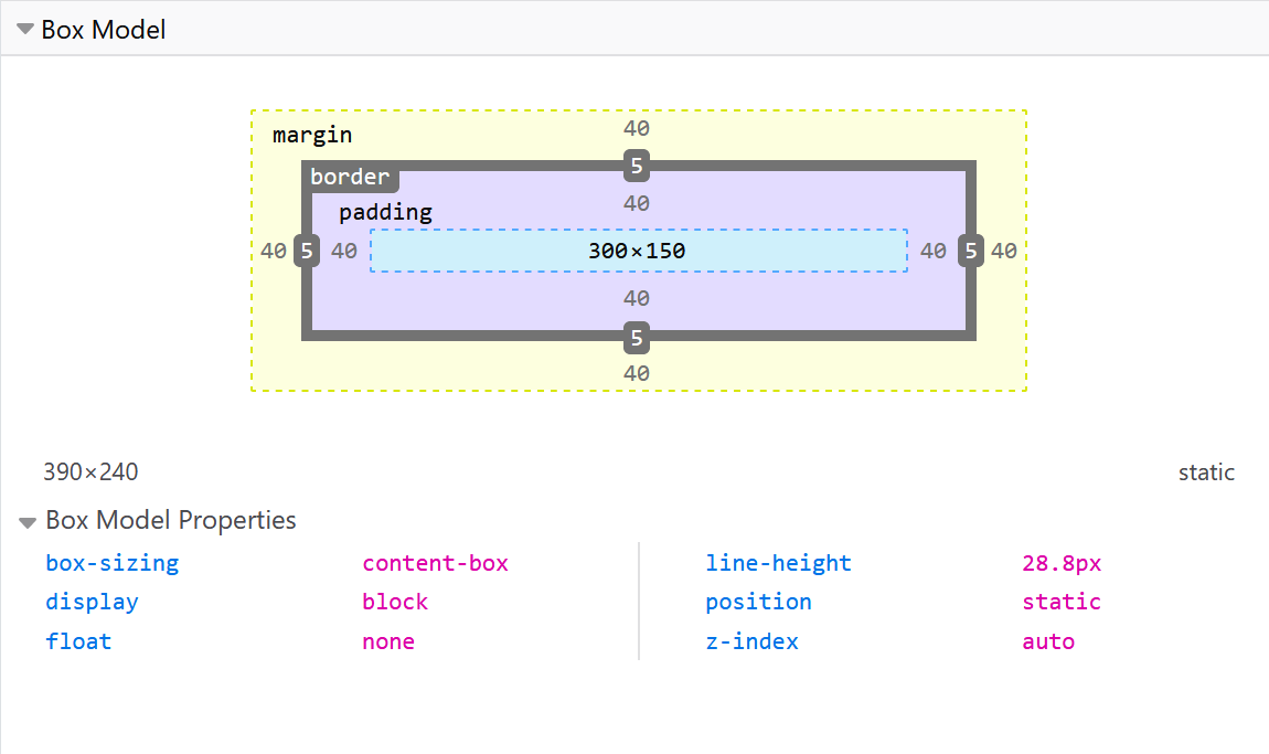
Use DevTools to View the CSS Box Model
Developer tools in the browser can help you understand the box model more quickly and clearly.
If you inspect an element in Firefox DevTools, you can see the element's size, plus the padding, border, and margin.
Inspecting an element this way is an effective method to verify whether the box dimensions match what you defined in CSS.
Margin-Padding-Border
You are probably already familiar with these properties, but now we will analyze them in detail.
Margin (margin)
The margin is an invisible space around the box, which can push other elements on the page.
It can have positive values, but also negative ones. Setting a negative value for a side can cause overlap over other elements.
Regardless of the display model used (standard or alternative), the margin always applies after the visible box size has been calculated.
We can control all margins simultaneously using the margin property, or individually with the expanded forms:
margin-topmargin-rightmargin-bottommargin-left
In the example below, try modifying the margin values to see the effects on the page.
Margin Collapsing
An important concept to understand is margin collapsing.
When two elements have touching margins, they combine into a single margin, with the size of the larger of the two.
In the example below, we have two paragraphs. The top paragraph has a bottom margin of 50px (margin-bottom: 50px;), and the second paragraph has a top margin of 30px (margin-top: 30px;).
Since the two elements touch, the margins collapse, so the actual space between the paragraphs is 50px, not the sum of the two margins.
You can test this behavior by setting margin-top to 0 for the second paragraph — you will see that the space between the two paragraphs remains 50px, the same as the first paragraph.
There are a number of rules that determine when margins collapse and when they do not. It is important to remember this behavior, especially when creating space using margins and not getting the desired result — the cause may be margin collapsing.
Complex situations of the margin property
As you have seen, the top and bottom margins of CSS boxes can combine into a single margin, applying the larger of the two.
☞ Note that margins of floated elements (float) or absolutely
positioned elements (position: absolute) never collapse.
Margin collapsing occurs in three main situations:
- Adjacent siblings: The margins of elements placed one after another collapse,
except when the last element needs to clear a previous
float. - No separation between parent and children: If there is no border, padding, inline content, height, or another element creating space between the parent's margin and the child's margin, the margins collapse.
- Empty blocks: If a block has no border, padding, content, or height, its top and bottom margins collapse with each other.
☞ Other complex situations may arise from combining the above.
These rules apply even when margins are set to 0. Thus, the margin of a child element can extend
outside the parent, even if the parent's margin is zero.
In the case of negative margins, the size of the collapsed margin is the sum of the largest positive margin and the smallest negative margin.
If all margins are negative, the smallest one applies. This behavior applies both to adjacent elements and nested elements.
Border
The border is positioned between the margin and padding. If using the standard box model, the border is added to the box's height and width. In the alternative box model, the border size reduces the content-box because it occupies part of the total width and height defined.
There are numerous properties for styling the border, as each of the four sides can have a different style, width, and color.
We can set style, width, and color simultaneously using the shorthand border property.
To set the style, width, and color individually for each side, we use:
border-topborder-rightborder-bottomborder-left
To control all sides simultaneously, we can use:
border-widthborder-styleborder-color
And to style a single side in detail:
border-top-widthborder-top-styleborder-top-colorborder-right-widthborder-right-styleborder-right-colorborder-bottom-widthborder-bottom-styleborder-bottom-colorborder-left-widthborder-left-styleborder-left-color
In the following example, we used both the shorthand and longhand forms to create varied borders. You can modify the values to better understand how each property works.
Padding
Padding is the space between an element's content and its border. It contributes to readability and the overall aesthetics of the layout.
Unlike margin, padding cannot have negative values — it can be 0 or any positive value.
Any background color applied to an element will also be visible in the padding area, making it ideal for creating visual space between content and border.
We can control padding individually for each side using:
padding-toppadding-rightpadding-bottompadding-left
Alternatively, we can use the shorthand form:
padding: 10px;In the following example, you can modify the values for the .box class and observe how the space between the text and the border changes. You can also adjust the padding for .container to see how it affects the space between the container and the inner element.
Box Model vs. Inline Boxes
All the rules discussed above fully apply to block boxes. Some properties, such as
padding, margin, and border, also apply to inline
elements, like span, but with limitations.
In the following example, we have a span element inside a paragraph. We set its width, height,
padding, border, and margin. You will notice that:
- Width and height are ignored.
- Padding and margin are applied but do not affect the positioning of other inline elements.
- Border and padding may overlap surrounding text.
💡 Recommendation: If you want an inline element to respect dimensions and behave like a
block, use display: inline-block;.
Using the inline-block Value
There is a special value for the display property that combines the behaviors of the two main
types: block and inline. This is extremely useful when we do not want an element to
create a line break, but we want it to respect the set dimensions and avoid overlaps, as seen in the previous
example.
An inline-block box behaves as follows:
- Respects
widthandheightproperties. Margin,padding, andborderinfluence the positioning of surrounding elements.- Does not create a line break, but can be larger than its content if explicit dimensions are set.
In the following example, we applied display: inline-block; to a span element. You
can change the value to block or remove it entirely to observe the differences.
This behavior is extremely useful, for example, when we want a link to have a larger clickable area by adding
padding.
The <a> element is inline by default, just like <span>. By applying
display: inline-block;, we can expand the active area of the link, providing a better user
experience.
You will encounter this technique frequently in navigation bars.
In the following example, the navigation bar is displayed inline (row) using
Flexbox. We added padding and a background color to the links, which changes on
:hover.
Initially, the padding appears to overlap the <ul> border because the
<a> is inline. By adding display: inline-block; in the
.lista-link a rule, the issue is resolved and the spacing is respected correctly.
Backgrounds and Borders
In this section, we will explore what can be achieved with backgrounds (background) and borders
(border) from the perspective of creativity and modern design.
Styling Backgrounds with CSS
The background property is a shorthand that combines multiple individual properties such as
background-color, background-image, background-position,
background-size, background-repeat, and background-attachment.
The example below is complex because it combines multiple backgrounds in a single declaration:
.box {
  background: linear-gradient(105deg, rgba(255,255,255,.2) 39%, rgba(51,56,57,1) 96%) center center / 400px 200px no-repeat,
              url(big-star.png) center no-repeat,
              red;
}
💡 Tip: For responsive backgrounds, use background-size: cover; or
contain and avoid fixed sizes if the design needs to adapt to different screens.
Background Colors
The background-color property defines the background color of an element. It accepts any valid color value and is applied beneath the element's content and padding.
Syntax:
background-color: red;– keyword valuebackground-color: #bbff00;– hexadecimal valuebackground-color: rgb(255, 255, 128);– RGB valuebackground-color: rgba(117, 190, 218, 0.5);– RGBA value, 50% transparentbackground-color: hsl(50, 33%, 25%);– HSL valuebackground-color: hsla(50, 33%, 25%, 0.75);– HSLA value, 75% transparentbackground-color: currentcolor;– current text colorbackground-color: transparent;– transparent backgroundbackground-color: inherit;– inherits from parent elementbackground-color: initial;– resets to initial valuebackground-color: unset;– resets to inherited or initial value depending on context
In the next example, we used different values to add background color to the box, title, and a
span element.
Background Images
The background-image property allows adding one or more images to the background of an HTML element.
The images are stacked on top of each other: the first declared image is displayed in the foreground, and the others are placed behind it, in the order they appear in the code.
In the following example, we have two images: one larger than the box and another smaller.
The example demonstrates two things:
- The larger image is not automatically resized to fit the box, so it is displayed only partially.
- The smaller image is automatically repeated to fill the available space.
If both a background color and an image are specified, the image will be displayed on top of the color.
It is recommended to specify a background color as a backup, for situations where the image does not load.
Syntax
background-image:
  linear-gradient(to bottom, rgba(255, 255, 0, 0.5), rgba(0, 0, 255, 0.5)),
  url("../images/imagine.jpg");

-----------------------------

background-image: none;
💡 Recommendation: For optimal performance, use SVG or WebP images whenever possible and avoid
heavy backgrounds on interactive elements. Also, use background-size: cover; to ensure full and
aesthetic coverage on various screens.
Controlling Background Repetition
The background-repeat property is used to control the repeating behavior of background images.
Available values are:
no-repeat– completely stops the image from repeatingrepeat-x– repeats horizontallyrepeat-y– repeats verticallyrepeat– repeats in both directions (default value)
Try these values in the example below to see the effect.
Background Image Sizing
In the example above, we saw how an image is cropped when the container it is in is smaller than the image itself.
In this situation, we can use the background-size property, which accepts length or percentage values, to fit the image within the background.
We can also use the following values:
- cover – the image will be large enough to fully cover the container, preserving proportions. Part of the image may be cropped.
- contain – the image will be resized to fit entirely within the container. If the image's aspect ratio differs from the container's, empty spaces may appear.
In the example below, we used a larger image and applied length units to fit it inside the box. You will notice that the image is distorted.
Try the following:
- Change the length units
- Remove the units and use the cover or contain values for
background-size
Background Image Positioning
The background-position property allows us to choose where the image appears within the box.
A coordinate system is used where the top-left corner of the box is the point (0,0), and positioning is done along the horizontal (X) and vertical (Y) axes.
☞ The default value for the background-position property is
0 0.
Most commonly, positioning is done with two values: one for the horizontal direction and one for the vertical direction.
Keywords such as top, left, bottom, right can be used:
.box {
  background-image: url("star.svg");
  background-repeat: no-repeat;
  background-position: top center;
}
Length and percentage values can also be used:
.box {
  background-image: url("star.svg");
  background-repeat: no-repeat;
  background-position: 20px 10%;
}
A mix of keywords and numeric values is also allowed:
.box {
  background-image: url("star.svg");
  background-repeat: no-repeat;
  background-position: top 20px;
}
In some cases, four values can be used to indicate distances from the edges:
.box {
  background-image: url("star.svg");
  background-repeat: no-repeat;
  background-position: top 20px right 10px;
}
In the example below, you can test these variations to position the image inside the box:
Using Color Gradients for Backgrounds
When using a gradient for the background color, it behaves like an image and can be set using the background-image property.
There are gradient generators available online that you can use to generate source code, which you can then copy and apply in your CSS document.
In the example below, you can see a linear gradient and a radial gradient that repeats.
Background Attachment
Another option available for backgrounds is how they behave when scrolling.
This behavior is controlled via the background-attachment property, which can have the following values:
- scroll – the background image scrolls along with the page. If the element's content scrolls, the background remains fixed within that element.
- fixed – the background is fixed to the viewport. It will not move when the element's content scrolls or when the page is scrolled. The background remains in the same position.
- local – this value was added later and attaches the background to the element itself. Thus, the background moves with the element's content.
The background-attachment property only has an effect when there is enough content to scroll. Therefore, the example below is designed so you can observe the differences between the three values:
Background – Using the Shorthand Form
Using the shorthand form allows you to set all different properties at once.
When using multiple backgrounds, you must specify all properties for the first background, then, after a comma, add the next background, and so on.
In the example below, you will see a gradient with size and position set, then a background image that does not repeat, and finally, a background color.
When using the shorthand background property, a few rules must be followed:
- The background color must be specified after the last comma,
- The value for background-size can only be provided after the background-position property, separated by a slash, like this: center/80%.
background: no-repeat center/80% url("../images/image.png");
☞ When positioning text over an image or colored background, ensure there is enough contrast so that the text is easy for users to read.
If you use a background image with text on top, it is recommended to also set a background color, so the text remains visible if the image fails to load.
Screen readers cannot interpret images, so they should only be used decoratively. Any important content should be included in the HTML document, not in the background.
Borders
When studying the box model, we observed how borders affect its size. Now, we will explore how to use borders creatively.
Typically, we use the shorthand border, where we set the width, style, and color of the border in a single line, applicable to all four sides of the box:
.box {
  border: 1px solid black;
}
But we can target a single side, for example:
.box {
  border-top: 1px solid black;
}
We can also use individual properties:
.box {
  border-width: 1px;
  border-style: solid;
  border-color: black;
}
Or:
.box {
  border-top-width: 1px;
  border-top-style: solid;
  border-top-color: black;
}
There is a variety of styles that can be used to customize borders. In the following example, different styles are applied to each side of the box.
Rounded Corners
The corners of a box can be rounded using the border-radius shorthand property. Alternatively, the longhand form can be used to style each corner individually.
Two values (lengths or percentages) can be used: the first for horizontal rounding, the second for vertical rounding. However, in most cases a single value is used.
For example, to round all four corners, we use:
.box {
  border-radius: 10px;
}
For a single corner, we can write:
.box {
  border-top-right-radius: 1em 10%;
}
In the following example, we set all four corners with a general value, then modified only the top-right corner:
Creative Shapes with border-radius
The border-radius property can be used not only to round corners, but also to create spectacular shapes, such as circles, capsules, or even organic forms. Here are a few examples:
Controlling Overflow with overflow
CSS provides a special property – overflow – that allows us to control the behavior of content when it exceeds the dimensions of a box.
Possible values for overflow:
- visible – content that exceeds the box will be displayed outside of it (default behavior);
- hidden – content that does not fit will be hidden;
- scroll – scrollbars are added, regardless of necessity;
- auto – scrollbars are added only if needed.
Here is an example using overflow: auto to allow vertical scrolling:
In the example above, content that exceeds the box height can be accessed by scrolling without affecting the rest of the layout.
It is recommended to test the overflow behavior in different scenarios, especially when working
with responsive components or when anticipating dynamic content.
Recommendations for an Accessible Experience
- Avoid
overflow: hiddenfor elements containing important information. - Use
overflow-wraporword-breakto prevent horizontal text overflow. - Ensure that interactive elements (buttons, links) are not hidden due to space constraints.
The overflow Property
The overflow property allows us to control content overflow in a box.
The default value is visible, which means content exceeding the box dimensions will be visible.
To hide overflowed content, we can use the hidden value. In this case, content that does not fit will be completely hidden, with the risk of losing information.
If you want to avoid losing content, you can always display scrollbars, even when there is no overflow, by using overflow: scroll;.
In the example above, scrollbars appear both vertically and horizontally. However, if you want only the vertical scrollbar, you can use overflow-y: scroll.
Open the example and replace overflow: scroll; with overflow-y: scroll; to see the
result.
You can also display only the horizontal scrollbar. Open the next example and uncomment the line
/*overflow-x: scroll;*/.
However, the above method is not recommended. To handle cases where a word is too long to fit in a box, it is advised to use the word-break or overflow-wrap properties.
☞ Scrollbars can appear simultaneously on both the X and Y axes by using two values for the overflow property. The first value applies to the X axis (horizontal), and the second to the Y axis (vertical).
For example, overflow: scroll hidden; will show the horizontal scrollbar and hide vertical
content.
If you want scrollbars to appear automatically only when necessary, use overflow: auto;. The browser will decide when to display scrollbars.
In the following example, uncomment the line overflow: auto; to see dynamic behavior.
Text that doesn't fit – text-overflow
When text is too long for the available space, we can control how it is displayed using the text-overflow property.
The most commonly used value is ellipsis, which shows three dots (…) at the end of the truncated text.
For text-overflow: ellipsis; to work correctly, the following conditions must be met:
- The element must have
white-space: nowrap; - It must have a fixed width (
width) overflow: hidden;must be set
Here is an example:
This type of display is ideal for titles, buttons, or any element where space is limited and we don't want the text to break onto multiple lines.
☞ If you want the text to wrap onto multiple lines, use
overflow-wrap: break-word; or word-break: break-all; instead of
white-space: nowrap;.
Block Formatting Context – BFC
BFC refers to a CSS concept where, when using the overflow: scroll; property (for example), a mini-layout is created within the document, with independent behavior. Elements around it cannot enter that box, and nothing inside that box can escape.
This allows for efficient and consistent scrolling within the box that has scrollbars, without interfering with surrounding elements.
Preventing content overflow in web design
As we will see later, modern layout methods handle content overflow quite well, as they are designed knowing that we cannot predict how much content will be in a document or in a box within a document.
In the past, fixed heights were used to align boxes, which were otherwise unrelated, resulting in fragile layouts with frequent content overlap.
Ideally, we should not use fixed heights for boxes in an HTML document.
When developing a website, special attention should be given to situations that may generate content overflow.
You should test the site with different amounts of content, adjust font sizes, and ensure the site behaves robustly and the CSS does not create issues.
Displaying scrollbars is usually reserved for truly special cases where we actually want to show them.
Advanced box styling techniques
In this section, I will show some advanced techniques and methods for styling boxes.
Box shadows
The box-shadow property allows you to add shadows to a box. Like text shadows, they are well supported by browsers, including IE9+ and Edge.
Simple shadow
First, let's look at a simple example.
As you can see, the box-shadow property value contains 4 components:
.simple-shadow {
  box-shadow: 10px 10px 10px rgba(0,0,0,0.7);
}
- The first length value represents the horizontal offset – the distance between the shadow and the box, to the right (positive) or to the left (negative);
- The second length value represents the vertical offset – downwards (positive) or upwards (negative);
- The third length value represents the blur radius – the amount of blur applied to the shadow;
- The fourth component is the color of the shadow.
Multiple shadows
Multiple shadows can be applied to the same box by separating each declaration with a comma:
.simple-shadow {
  box-shadow: 1px 1px 1px white,
              2px 2px 1px white,
              3px 3px 1px lime,
              4px 4px 1px lime,
              5px 5px 1px black,
              6px 6px 1px black;
}
The example above is playful, but you can create multiple shadows with a more realistic look, based on several light sources.
Unlike text-shadow, for box-shadow you can use the inset value, which moves and manipulates the shadow inside the box.
In the next example, we configured a button with several states: focus / hover / active. The button has a default black shadow and two inner shadows, one white and one black, placed in opposite corners to give an interesting effect.
When the button is pressed, the active state replaces the first shadow with an inner shadow, giving the appearance of the button being pressed.
☞ There is another property that can be added to box-shadow: an additional length value, placed just before the color. This is called spread radius and it makes the shadow larger than the box.
Filters
CSS filters allow you to apply visual effects to HTML elements, such as blurring, color adjustments, brightness, or contrast. They are useful for styling images, backgrounds, or even text, adding dynamism and expressiveness to web design.
Simple filter example
In the following example, we will apply a blur effect (blur) and a grayscale effect
(grayscale) to an image:
List of Most Common CSS Filters
- blur(px) – applies blur;
- brightness(%) – adjusts brightness;
- contrast(%) – changes contrast;
- grayscale(%) – converts image to grayscale;
- sepia(%) – applies a sepia effect (warm, vintage tones);
- saturate(%) – intensifies or reduces color saturation;
- invert(%) – inverts colors;
- opacity(%) – sets transparency;
- drop-shadow(x y blur color) – adds a shadow similar to
box-shadow, but applied as a filter.
Combining Filters
Filters can be combined in a single line, separated by spaces:
filter: brightness(120%) contrast(90%) sepia(30%);
☞ CSS filters work best on images and graphic elements, but can also be applied to text or backgrounds. However, it is recommended to test compatibility across different browsers, especially when using complex effects.
Box Size – The box-sizing Property
By default, the size of a box in CSS is calculated using the content-box model, meaning that
width and height refer only to the content area, excluding padding
and border.
This behavior can lead to unexpected results, especially with precise layouts. Therefore, it is recommended to use the border-box value, which includes padding and border in the box dimensions.
Comparing the Two Models
In the following example, we have two boxes with the same width but different behaviors depending on the
box-sizing value:
Result
- content-box: total width is
200px + padding + border, so the box will be larger than 200px. - border-box: total width remains 200px, with padding and border included within this dimension.
☞ It is a good practice to set box-sizing: border-box; globally
to avoid complicated calculations and unexpected behavior.
* {
  box-sizing: border-box;
}
Setting Limits – min/max-width and min/max-height Properties
These properties allow flexible control over box dimensions, preventing elements from becoming too small or too large.
min-width: sets the minimum width a box can have.max-width: sets the maximum allowed width.min-height: sets the minimum height.max-height: sets the maximum height.
In the example below, we have a box that resizes according to its content but cannot be smaller than 150px or wider than 400px:
Key Points
- These properties are extremely useful in responsive design.
- Avoid over-sizing or excessively shrinking elements.
- They can be used together with
width: 100%to create fluid but controlled layouts.
☞ Practical example: a button that should not be smaller than 100px, nor larger than 300px, regardless of the text inside.
Outline vs Border – Differences and Accessibility Uses
Although both create a contour around an element, border and outline behave
differently and serve distinct purposes. border is part of the box model and affects the element's
size. outline is an external contour, often used to highlight focus, especially for accessibility.
border: affects size and can be applied to each side.outline: does not affect size and is applied uniformly around the element.outlinecannot be rounded withborder-radius.outline-offset: allows spacing the outline away from the element.
In the example below, we have a button with a permanent border and an outline that
appears on focus:
Key Points
outlineis essential for users navigating with a keyboard.- Do not remove
outlinewithout providing a clear focus alternative. - You can combine
borderfor style andoutlinefor accessibility.
☞ Practical example: an accessible form should highlight active fields with
outline, not just subtle color changes.
Smooth Scrolling – scroll-behavior Property
The scroll-behavior property controls how scrolling occurs on the page. The smooth
value creates a gentle transition, ideal for modern navigation, avoiding abrupt jumps.
auto: default behavior, no transition.smooth: smooth scrolling with a pleasant visual effect.
In the example below, links navigate to page sections, and scrolling is smooth thanks to
scroll-behavior: smooth:
Key Points
- Applied to the
htmlelement or individual containers. - Works only with internal links (
href="#id"), not with mouse wheel scrolling. - Can be combined with JavaScript for more complex effects.
☞ Practical example: a "Back to top" button that returns the user to the top smoothly, without visual shocks.
Visual Magic – backdrop-filter Property
backdrop-filter applies graphic effects (like blur or contrast) to the background of a
semi-transparent element. Ideal for modern interfaces where you want the background visible but softened.
blur(): blurs the background.brightness(): adjusts brightness.contrast(): modifies contrast.saturate(): intensifies colors.grayscale(): turns the background to grayscale.
In the example below, we have a section with a blurred background over an image:
Key Points
- Works only on elements with a semi-transparent background (
rgbaortransparent). - Requires browser support – works in Chrome, Edge, Safari, but not all Firefox versions.
- Multiple filters can be combined for complex effects.
☞ Practical example: a fixed menu with a blurred background over page content – elegant and readable.
Precise Ratios – aspect-ratio Property
aspect-ratio allows setting a fixed ratio between an element's width and height. Extremely useful
for images, videos, cards, or any box that must maintain its shape regardless of content.
aspect-ratio: 1 / 1– perfect square.aspect-ratio: 16 / 9– widescreen video format.aspect-ratio: 3 / 4– vertical ratio, ideal for portraits.
In the example below, we have three boxes with different ratios, all resizing while keeping their proportions:
Key Points
aspect-ratioworks without the need forpadding hacksorJavaScript.- It is supported in most modern browsers.
- It can be used together with
object-fitfor responsive images.
☞ Practical example: a grid of cards that maintains proportions regardless of content – ideal for galleries or portfolios.
Controlling Images – The object-fit Property
The object-fit property controls how an image or video fits into a container with fixed
dimensions. It is extremely useful when we want to preserve the image's aspect ratio without distorting it.
fill: the image completely fills the container, and may be distorted.contain: the image resizes to fit completely, preserving the aspect ratio.cover: the image covers the container, preserving the aspect ratio, but may be cropped.none: the image is not resized.scale-down: behaves likenoneorcontain, depending on what fits best.
In the example below, we have three images with fixed dimensions, each with a different behavior:
Key Points
object-fitworks only on media elements:<img>,<video>,<picture>.- It is ideal for cards, galleries, profiles, or responsive banners.
- It can be combined with
aspect-ratiofor full control of proportions.
☞ Practical example: a user's profile image that must remain square and not be cropped or distorted.
Element Positioning – The position and z-index Properties
With position we can control exactly where an element appears on the page. And with
z-index we decide who appears “on top” when elements overlap.
static: default position, no changes.relative: moves relative to its initial position.absolute: positions relative to the nearestrelativeparent.fixed: stays fixed on the screen, even when scrolling.sticky: behaves likerelativeuntil a point, then becomesfixed.
We have three colored boxes that overlap. Each has a different position and a z-index that
determines the order:
Key Points
absoluterelies on a parent withposition: relative.z-indexworks only on positioned elements (relative,absolute, etc.).- A higher
z-indexvalue means "in front".
☞ Practical example: a menu fixed in the corner of the page that stays visible while scrolling over content.
Removing the Visual Container – display: contents
With display: contents, the HTML container disappears visually, but **its children remain active**
in the layout and styling. It's like "dissolving" the box while keeping its contents.
- The parent element no longer generates a box in the layout.
- Children behave as if they were directly in the higher-level container.
- Useful for simplifying visual structure without modifying the HTML.
We have two identical sections, but one uses display: contents. See the difference in style and
spacing:
Key Points
display: contentsdoes not work on all elements (e.g.,<table>).- JS events and CSS styles applied on the container may be lost.
- Ideal for flexible layouts or when you want to "break" a structure without modifying the HTML.
☞ Practical example: a wrapper used only for organization, but which should not affect the visual style.
Isolating Style and Layout – The contain Property
contain is a CSS property that isolates an element from the rest of the page to improve
performance and prevent unexpected layout effects.
- Relevance: increases rendering speed and prevents style interference.
- Usage: applied on independent components such as cards, sections, or widgets.
- Useful values:
layout,style,paint,size,content.
We have two identical cards. The second one has contain: layout style;, which isolates it from the
rest of the layout:
Key Points
containis essential for modern web components.- Prevents external styles from affecting the internal layout.
- Improves performance by reducing style and layout recalculations.
☞ Practical example: a chat widget or a product card that must remain stable regardless of surrounding content.