How to Build a Professional Skill Card with Progress Bars in HTML and CSS
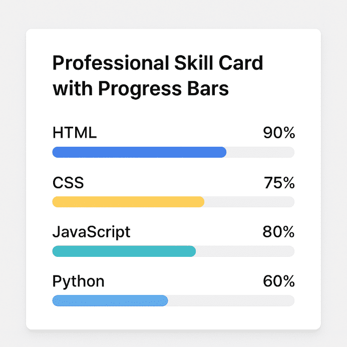
An interactive card with skills and progress bars is an excellent component for portfolios, digital resumes, or personal dashboards. Using HTML and CSS, we can build a clear, responsive, and visual structure that showcases competencies professionally.
HTML Structure of the Card
The HTML markup relies on a series of logically grouped elements:
- A main container that defines the card using the
.ib-cardclass - A header for the section title with the
h4.ib-card-titleelement - A list of skills (
ul.ib-skill-list), each containing a name and progress bar - The percentage is shown visually using a dynamic width
and a numeric label
The HTML is simple and semantic, with each element having a dedicated class for styling.
CSS Fundamentals: General Styling
The CSS file starts from a basic structure:
- Resetting margins with
box-sizing: border-boxfor consistency - Using a generic font and a gray background for the webpage
- Responsive columns that adjust based on screen size (using media queries)
This approach ensures good compatibility across mobile, tablet, and desktop devices.
Card and Content Design
The card is styled with:
- A white background and rounded corners for a modern look
- A subtle shadow to create depth
- Balanced padding for inner spacing
The .ib-card-header section contains the title, while .ib-card-body holds the stylized skill list with spacing and vertical alignment.
Progress Bars and Labels
Visual Structure
The progress bar has a low height and a subtle background color. Inside, .ib-progress expands horizontally based on the percentage. Styling includes:
- Rounded corners and smooth transition on dimension changes
- An absolutely positioned label showing the percentage (
.ib-progress-label)
Customizable Colors
There are CSS classes dedicated to colors: .bg-primary, .bg-warning, .bg-info, etc. These apply to both the bar color and the label, including a decorative triangle tip using ::after.
Responsive Behavior and Reusability
The .ib-col-lg-4 class provides flexibility in scaling the card, and media styles make the component adaptable in grid or flex layouts. Moreover, its structure allows reuse across various contexts like dashboards, personal profiles, and interactive resumes.
Expansion Ideas
- Add animations on card load using
fade-in - Implement dark mode via a toggle
- Enable tooltips for extra skill details
- Use JavaScript to dynamically generate skills from JSON
These enhancements turn a simple card into a sophisticated and interactive component.
Conclusion
The professional skill card with progress bars is an elegant and functional way to display competencies. With simple HTML and modular CSS, the design can be easily customized and extended—ideal for any developer or designer looking to build an attractive and informative portfolio. Download archive


Be the first to comment!